
Institutional Flow Tracker: What It Should Show and How Traders Should Use It
•Dave @ Moby Tick
An institutional flow tracker should do one thing really well:
help you see where larger participants are active without burying you in fake certainty.
That is the bar.
The phrase gets abused constantly, but the useful version is straightforward. A real institutional flow tracker should help traders identify:
- which sectors are active
- which names are unusual versus baseline
- which price zones keep attracting large activity
- whether activity is isolated or part of a broader rotation
If it cannot do that, it is probably just another flashy dashboard.
What Is an Institutional Flow Tracker?
An institutional flow tracker is a tool or workflow built to surface signs of meaningful large-participant activity.
That can include:
- dark pool activity
- block trades
- sector rotation behavior
- ETF-level institutional flow
- repeated ticker-level price clusters
The point is not to predict the future. The point is to make institutional participation visible enough to improve research and prioritization.
Why Most Institutional Flow Trackers Still Miss the Point
A lot of products claim to track institutional flow, but what they really do is show a pile of disconnected signals and hope the user supplies the discipline.
The stronger version is simpler:
- start broad
- identify concentration
- drill into the names driving it
- map activity back onto price structure
- compare against history
That sequence matters because institutional flow is mostly useful as a ranking tool. It helps you decide where to spend attention first.
What the Best Institutional Flow Trackers Show
Sector-level concentration
The best trackers help you see where money is clustering before you waste time on random names.
Ticker-level unusual activity
They show which names are truly elevated relative to normal behavior.
Repeated price zones
They highlight where institutions have been active more than once.
Historical context
They let you compare today’s activity to recent patterns instead of reacting to one-day noise.
Clear workflow support
They help you move from market scan to ticker drill-down to chart review.
Chart-Backed Example: Sector Flow Delta vs SPY Weight
The embedded chart below is the kind of output an institutional flow tracker should actually produce. Instead of just saying “technology was active,” it compares recent dark pool flow share against SPY sector weights so you can see which sectors are screening overweight or underweight.
In our current three-day snapshot:
- Information Technology is roughly +16.9% versus SPY weight
- Communication Services is about +4.0%
- Financials and Healthcare are much closer to neutral or underweight
That is immediately more useful than a generic “money is moving into tech” statement. It tells you the degree of concentration and helps you rank where capital is leaning most aggressively.
That is exactly what a tracker should do: measure concentration in a way that improves prioritization.
How Traders Should Actually Use One
Step 1: Start with the sector layer
See which sectors are showing the strongest institutional participation.
Step 2: Build a shortlist
Pull the names with the strongest unusual activity.
Step 3: Check the levels
Look for repeated price zones and meaningful notional size.
Step 4: Compare against history
Ask whether the activity is recurring, building, or fading.
Step 5: Overlay it on your chart
Institutional flow becomes useful when it sharpens level selection and watchlist ranking.
How to Read the Strongest Signals
The strongest institutional flow signals usually combine three things:
- breadth — multiple names inside the same sector are active
- depth — the notional value is meaningful, not just visually large
- repetition — similar price zones keep showing up over time
When all three line up, you usually have something worth deeper work. When only one shows up, the signal is weaker and should be treated more cautiously.
What to Avoid
Avoid trackers that:
- reduce everything to one mysterious score
- imply every large print is directional
- show activity without sector context
- offer alerts but no historical comparison
- make it impossible to understand why a name is being surfaced
That stuff sells. It does not help much.
Where DarkPoolHeatmap and MobyTick Fit
DarkPoolHeatmap.com works well as a free institutional discovery tool. It helps traders quickly see sector and ticker-level activity.
MobyTick Trading is the stronger institutional flow tracker when you want deeper historical context, stronger repeated-level research, and a workflow built around dark pool and block-trade analysis.
Final Take
A real institutional flow tracker should help you focus faster, rank better, and understand where large participants are actually active.
That is enough. It does not need to pretend it knows the future.
Use DarkPoolHeatmap.com for free discovery and MobyTick Trading when you want stronger history, alerts, and deeper institutional research.
Chart-Backed Example: Sector Flow Delta vs SPY Weight
An institutional flow tracker should help traders see where participation is overweight or underweight relative to something stable. The chart below compares recent dark pool flow share with SPY sector weights over the last three days.
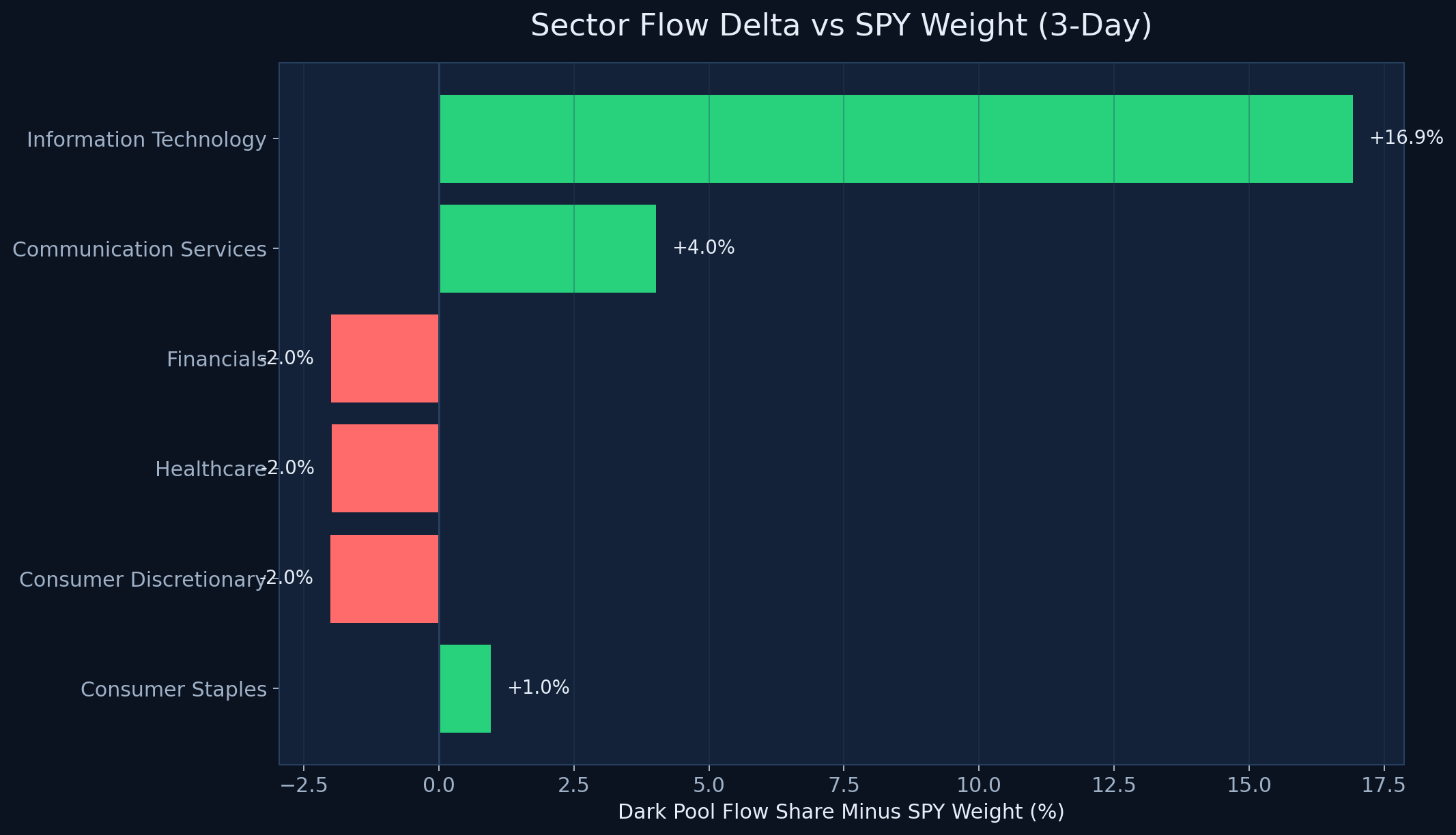
This is the kind of tracker view that actually helps with prioritization. Information Technology screened at roughly +16.9% versus its SPY weight, and Communication Services at about +4.0%. That is a much cleaner read on where capital was leaning than simply saying those sectors were “active.”
By contrast, sectors like Financials and Healthcare were closer to or below their SPY weight in the same window. That contrast is what makes an institutional flow tracker useful: it lets traders decide where the capital concentration is strongest before they spend time drilling into single names.